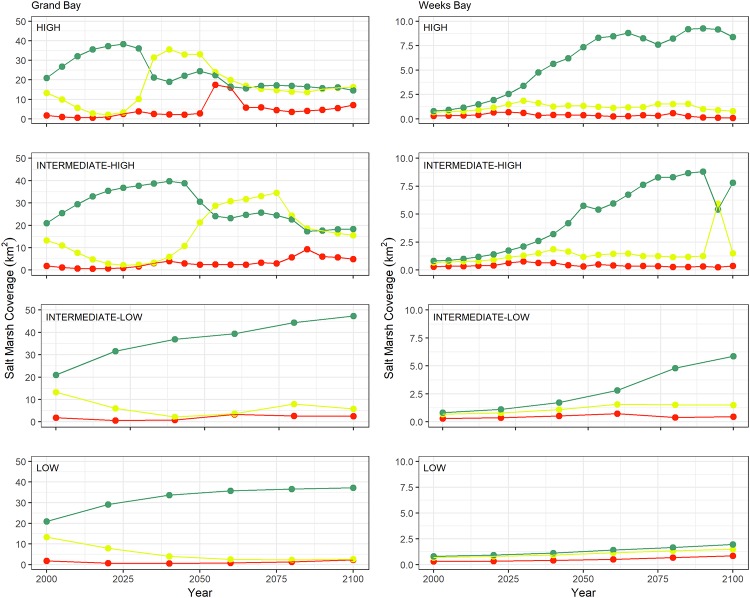
Fig 7. Marsh productivity coverage change graphs.
The graphs categorized in low, medium, and high represented by red, yellow, and green lines from 2000 to 2100 for the Grand Bay (left column) and Weeks Bay (right column) estuaries under the low, intermediate-low, intermediate-high, and high SLR scenarios listed from bottom to top row, respectively.

