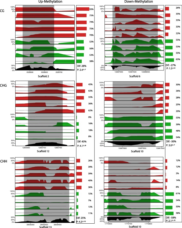
Fig. 4.
Visualization of PELT methylation patterns across representative regions identified as differentially methylated (shaded regions) for the nine individuals sequenced in this study: five offspring of damaged individuals (top; red), and four control offspring (bottom; green). Bars and percentages to the right of methylome plots show the percent of methylated cytosines mapped in that region for each individual. The Black track at the bottom of each panel shows the mean difference in percent methylation across this portion of the genome. “Dif.” = Percent mean difference between treatments, and “P” = P-Value of generalized linear model comparing distribution of methylated and unmethylated cytosines between treatments

