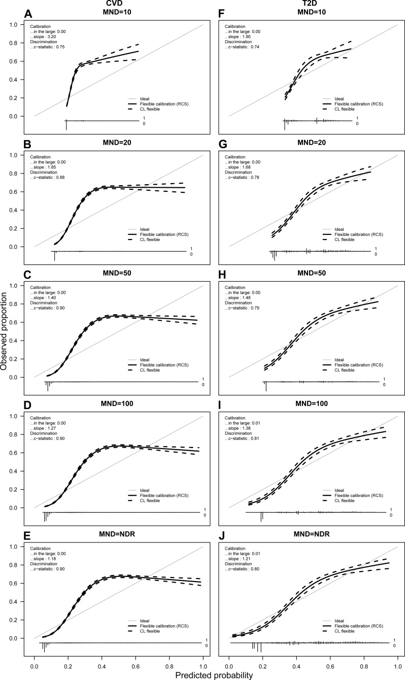
Figure 4. Calibration plots for CVD (A–E) and T2D (F–J) for average probabilities and different MND values.
Predicted probabilities from each fold were saved and averaged over 10 repetitions. For each calibration plot in the upper left corner the intercept value (“in the large”) and slope is shown together with the AUC value or c-statistic. The main part of the plot is a flexible calibration curve based on restricted cubic splines, with a pointwise 95% confidence interval (dashed lines), followed by a case/non case histogram at the bottom.

