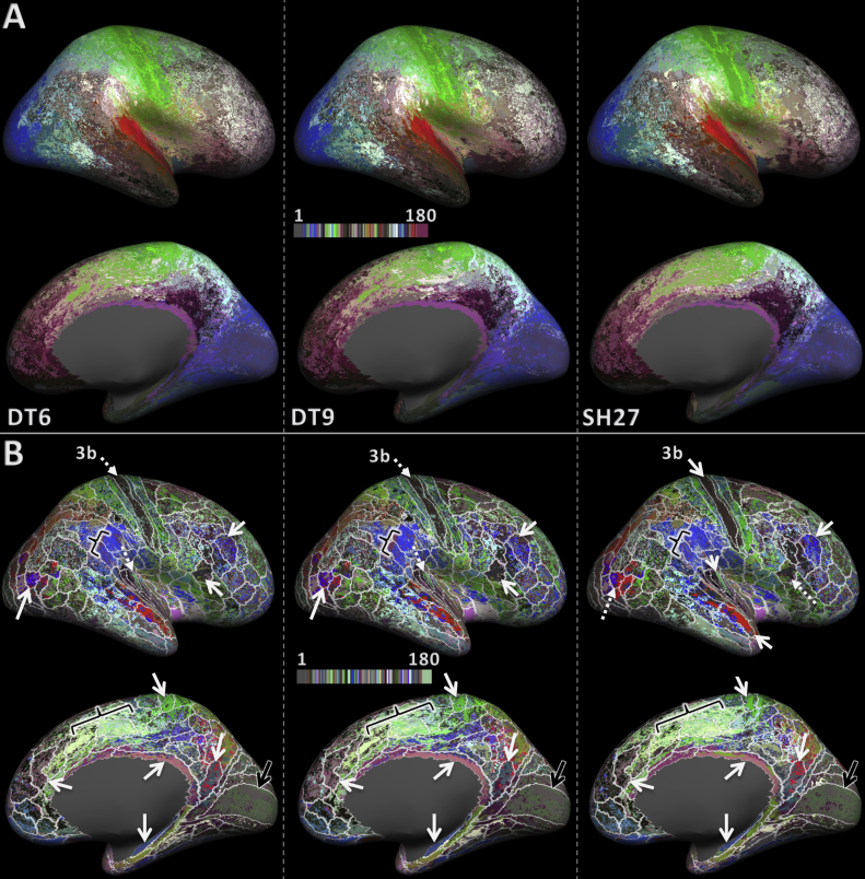
Fig. 3.
Maps of the group average whole hemisphere parcellation result for feature sets DT6, DT9, and SH27 (left to right). (A) Shows the original colour scheme from the HCP-MMP. (B) Shows the same results as A but with the colour scheme shuffled to achieve better contrast between neighbouring areas. In addition, the boundaries of the training areas are overlayed in white. The solid white arrows signify areas that have a large overlap with the training labels. The dotted white arrows indicate that an area is subdivided or not as well classified as it was for another feature set. The black arrows point to the V1 area that did not classify as well, despite its distinct architecture. The black brackets point out regions in which one cluster expands over several training labels.

