
FIGURE 2.
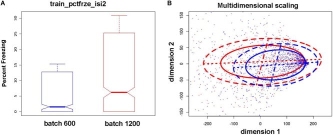
Differences in means and variance of phenotypes between the two batches/cohorts. These results illustrate the strong effects of the urine collection procedure on subsequent behavioral/cognitive measures. Blue: 600 cohort, red: 1,200 cohort. (A) Example boxplots for train_pctfrze_isi2 phenotype. The cognitive measure illustrated is the percent freezing during the second inter-stimulus interval, a measure of test learning. The mean percent freezing and variability in this measure was much larger in the cohort of 1,200 than the cohort of 600 mice. (B) Pairwise distances between samples are computed utilizing all train_pctfrze phenotypes. The resulting distances are projected on two dimensions and ellipses containing 50/75% of the data are drawn (solid and dashed lines, respectively). This illustrates the presence of different data distributions in both location and spread. Due to these differences our analysis was performed separately for each cohort.