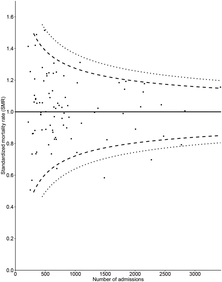
Figure 4.
Funnel plot for the APACHE IV standardised in-hospital mortality rate for all ICU admissions, control limits inflated for overdispersion. The value of the quality indicator is presented on the vertical axis and the number of ICU admissions included when calculating the quality indicator is presented on the horizontal axis. Small dots represent ICUs and the solid line represents the benchmark value. Dashed lines represent control limits, different types of dashed lines are used to differentiate between the 95% and 99% control limits.

