Figure 3.
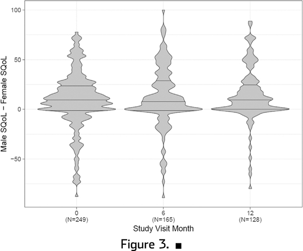
Violin plots showing distribution of difference in male and female sexual quality of life (SQoL) over time. Horizontal lines within plots represent median (center lines) and interquartile range (upper line is 75th percentile and lower line is 25th percentile). Width represents number of responses.

