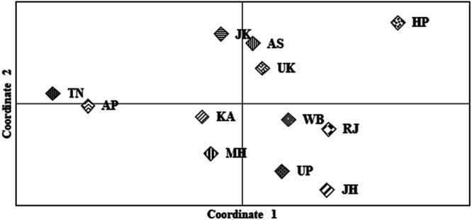
Figure 1.

Plot to visualize PCoA based on genetic relationship between the populations from different bio-geographical regions of India. X and Y axes represent Coordinate 1 and 2, respectively and explain 39.42 and 26.32 percentage of total variance respectively. More than 60% of the variance was explained by the two coordinates. Each of the 12 populations occupied their relative position on the plot. As can be gleaned from the plot all the populations were observed to be in close proximity with each other irrespective of their geographic affiliations. The abbreviations are explained in Supplementary Table S1.
