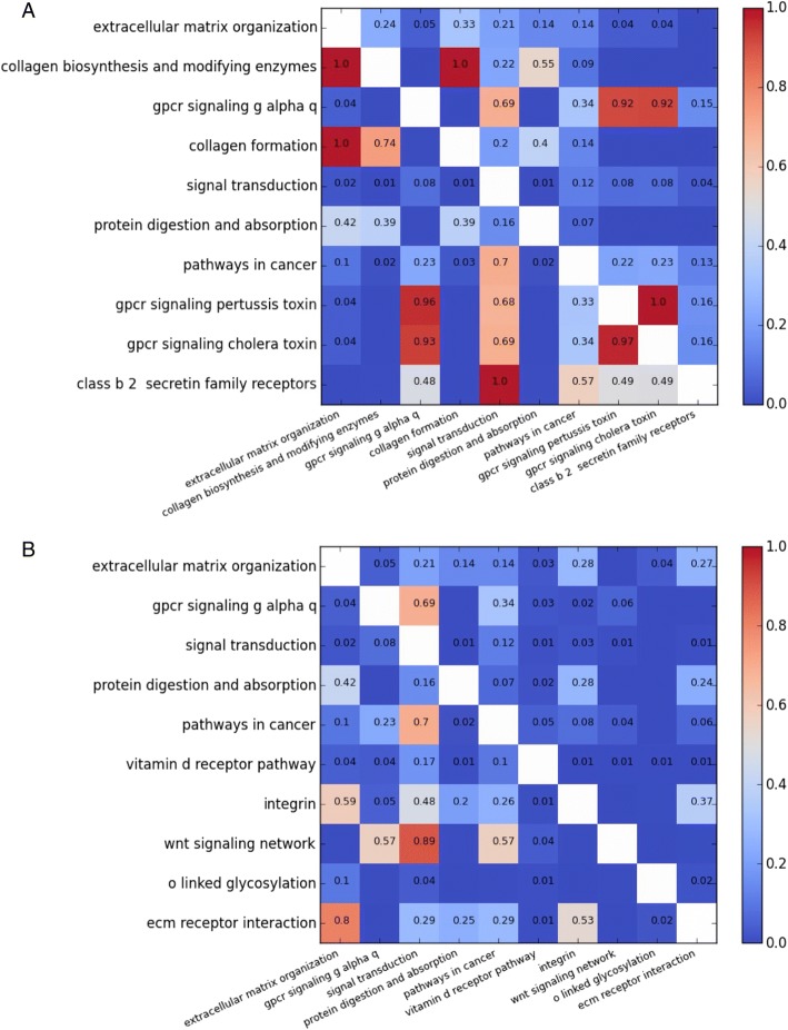
Fig. 5.
Pathway redundancy heat maps. a Pathway overlap for top ten enriched pathways. b Pathway overlap for top ten enriched pathways after application of set cover. The values represent asymmetric overlap, i.e. for each pathway shown on the left axis, values represent the proportion of genes that are also included in the pathway shown on the bottom axis

