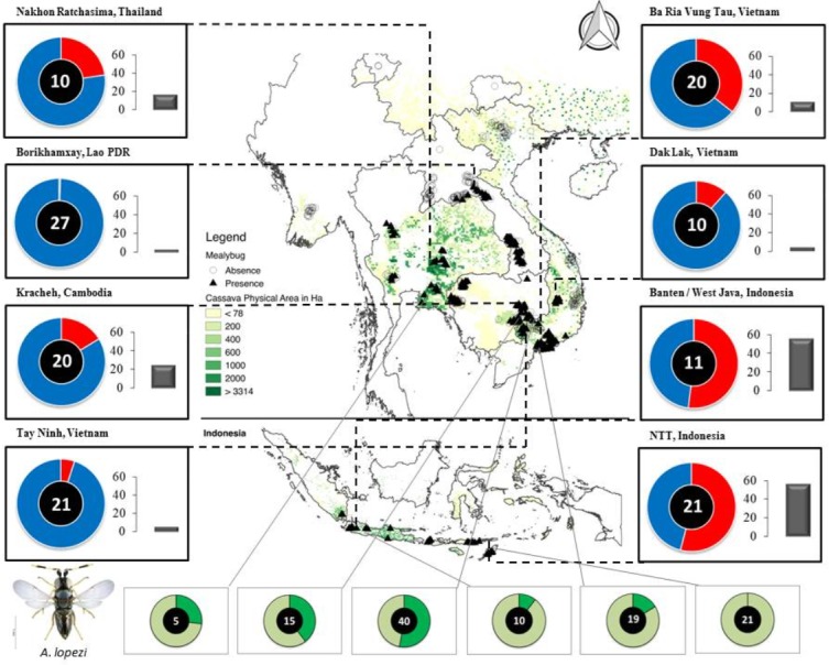
Figure 1. Map of Southeast Asia, depicting P. manihoti spatial distribution, infestation pressure and A. lopezi parasitism rates.

Doughnut charts in the left and right margins represent field-level incidence (i.e., red portion—on a blue background—reflecting the proportion of P. manihoti affected tips, ranging from 0 to 1 for full circumference), and are complemented with bar charts indicative of plant-level P. manihoti abundance (i.e., average number of individuals per tip). The number inside each doughnut reflects the number of fields sampled per locale. Doughnut charts in the lower panel indicate average A. lopezi parasitism rate at six selected locales (depicted by the dark green section—on a light green background—reflecting proportion parasitism ranging from 0 to 1 for full circumference), with varying numbers of fields sampled per locale. The distribution map is created as overlay on a 2005 cassava cropping area (You et al., 2017). Photograph: Anagyrus lopezi (credit G. Goergen, IITA).
