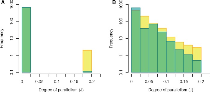
Fig. 4.
—Distribution of the degree of parallelism (estimated as the pairwise Jaccard Index, J) from the real data (yellow bars) and simulated data from the best-fit models (blue bars). Overlapping regions appear green. Panels (A) and (B) show real and simulated data for synonymous and nonsynonymous mutations, respectively.

