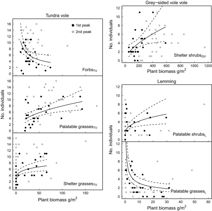
Figure 4.

Relationship between plant biomass and rodent abundance. Points show raw data for both peaks (peak 2006–2007 as black points and peak 2010–2011 as grey points) and lines denote predicted values (black lines; predictions, stippled lines; 95% confidence interval of the prediction) for “best” model from the first peak. For each plot, other variables included in the model were centred on their respective means
