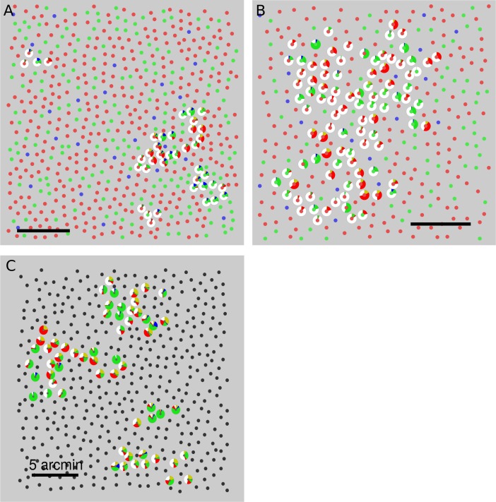
Figure 3.
Spatial variation of hue and saturation scaling. Targeted cones are surrounded by a pie chart that represents the distribution of button presses elicited from that cone. Data from every seen trial across all three stimulus intensities were used to compute the pie charts. Cone locations are denoted by smaller circles. The spectral class of each cone is indicated by the color. L cones = red, M cones = green, S cones = blue, unclassified = black. (A) S20053, (B) S20076, (C) S20092. Scale bars indicate 5 arcmin or ∼24 μm. Note: In an earlier publication (Sabesan et al., 2016), pie charts were used to illustrate the distribution of single color names over trials; here they denote the mean response over trials.

