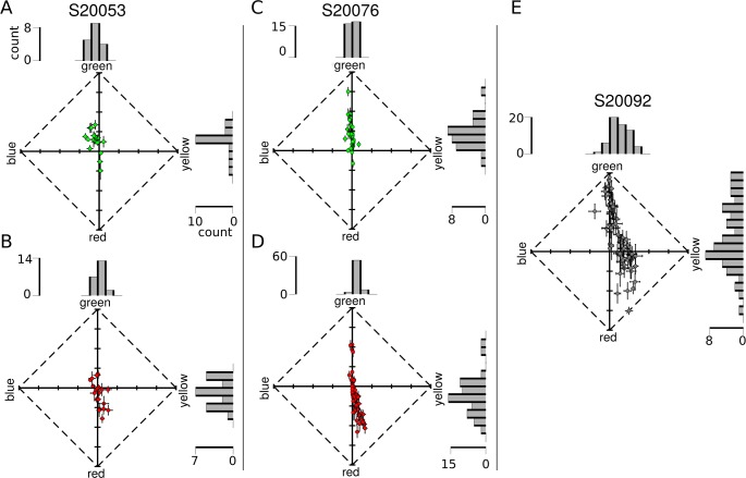
Figure 6.
Hue and saturation reports from targeted cones. Each dot represents the mean response (of all seen trials, across all stimulus intensities) from an individual cone. Data are represented in a uniform appearance diagram, where the y-axis denotes a bias of responses toward greenness versus redness and the x-axis denotes a bias toward blueness versus yellowness. (A) M cones and (B) L cones tested in S20053. (C) M cones and (D) L cones tested in S20076. (E) Data from unclassified L and M cones in S20092. Error bars indicate SEM. Histograms above and to the right of each plot illustrate the distribution of responses along each dimension. Scale bars denote the number of cones in each bin.

