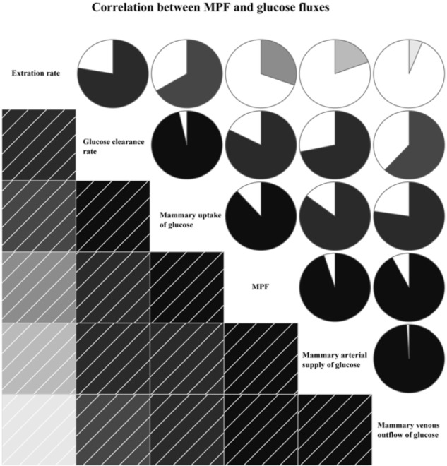
FIGURE 4.

Correlation between mammary plasma flow (MPF) and glucose fluxes. In left square matrix, the deeper color and the higher the saturation of the cells, the greater positive correlation of variables. Meanwhile, in right circle matrix, the filled pie charts from clockwise visualize the positive correlation of variables.
