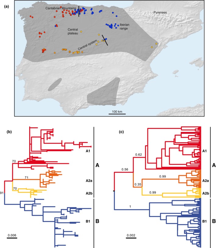
Figure 1.

Phylogeography of Neomys anomalus with the main mitochondrial groups shown in different colors. (a) Map showing the distribution of the mitochondrial phylogroups with two lines indicating the locations of the contact zones between the main groups, A and B. The dark gray area represents the species distribution range. Names of the main geographical terms mentioned in the text are shown. (b) Maximum‐likelihood phylogenetic tree with midpoint rooting of the cytochrome b and D‐loop concatenated sequences showing the percent bootstrap support of the main nodes and the scale in substitutions per position. (b) Bayesian tree of the same sequences with the posterior probability values of the main nodes
