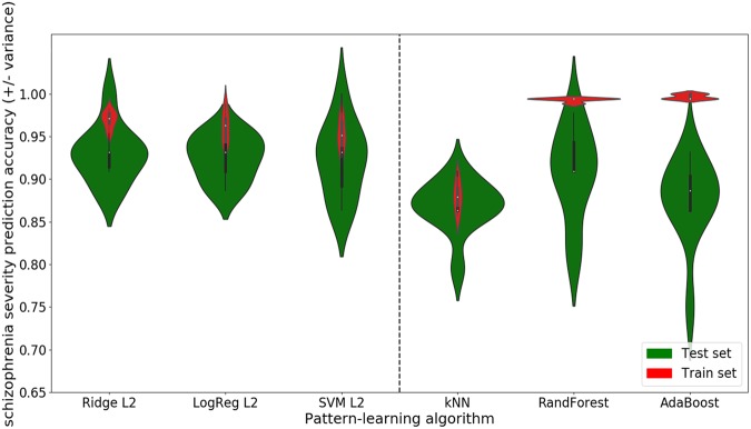
Fig. 4. Probing complex relationships among the PANSS items.
We explored the hypothesis that more complex patterns may explain relationships between the different PANSS items. We thus compared the predicting performance of models looking for additive effects (left side) to the prediction performance of models looking for higher-order effects (right side). The red violin plots display the in-sample accuracies (train set) while the green plots display the generalization performance (test set). The width of the violins illustrates the density of the obtained performances. For instance, the shape of the first green violin plot on the right side (skinny on each end and wide in the middle) indicates that the obtained accuracies are highly concentrated around the median. The height of the violins indicates the variability (i.e., range of the obtained accuracies). Short violins represent a slight while long violins represent a substantial variability. Linear models including the ridge regression (Ridge L2), the logistic regression (LogReg L2), and the support vector machine (SVM L2) are plotted on the left side of the dashed bar. Non-linear models including the k nearest neighbor (kNN), the random forest (RandForest) and the adaptive boosting (AdaBoost) are plotted on the right side. As a general observation, the green violin plots of the linear models indicate on average a better performance with less variance thus appear to be more adapted to this setting. These results suggest that the PANSS items are perhaps mostly individually predictive as much as this evidence is supported by our multi-site patient dataset

