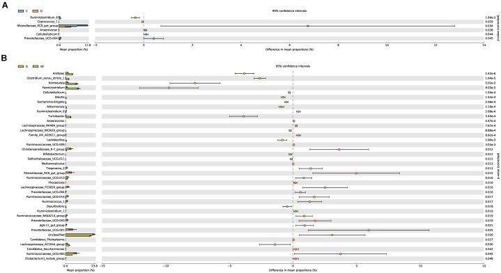
FIGURE 5.
Differences in bacterial abundance between the groups. The left side of the graph shows the abundance ratios of different strains in two samples. The middle graph shows the difference in bacterial abundance within the 95% confidence interval. The rightmost values are the P-values of the significance test. (A) Differences in species abundance between groups G and C. (B) Differences in species abundance between groups G and GF.

