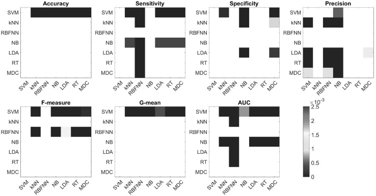
Fig. 2.
Heat-maps of p values associated with the t test values presented in Table 3, thresholded according to the Bonferroni corrected threshold (0.0025; see also Table 3). Colored entries indicate that the method presented in the row performed better than the method presented in the column, in a statistically significant manner. Note that although the statistical test we performed to test the null hypothesis that performances of a pair of methods are not different, here we combine the p values of these tests together with the average performances presented in Table 2, to present which measure performed better than the other. White entries present comparisons which we did not make (along the diagonal), or comparisons that yielded no statistically significant difference (Color figure online)

