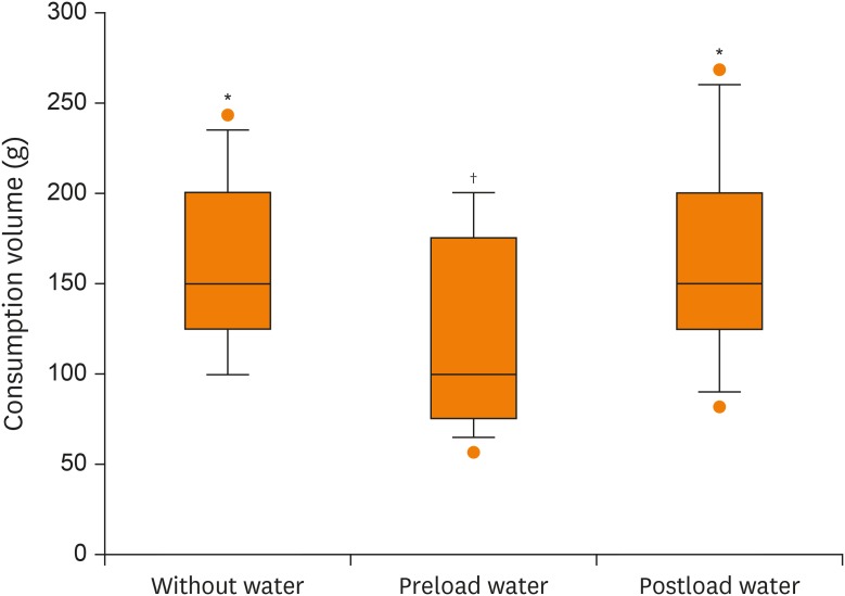
Figure 1. Consumption volume on test meals served with and without water. Each box plot is composed of 5 horizontal lines that display the 10th, 25th, 50th, 75th, and 90th percentiles, respectively. All values above the 90th and below the 10th percentiles are plotted separately.
The different marks indicate significant differences by a repeated measures analysis of variance followed by Bonferroni-adjusted pairwise comparisons.

