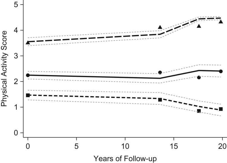
Figure 1.
Physical activity trajectories from midlife to old age (n = 3,331; aged 58–81 years at follow-up), British Regional Heart Study, 1978–2000. The small dashes (with squares) represent the plotted trajectory curve for the low/decreasing group (21.3%), the solid line (with circles) represents the light/stable group (51.8%), and the large dashes (with triangles) represent the moderate/increasing group (27.0%). The plotted points show the mean physical activity score and 95% confidence intervals at each time point for each trajectory group.

