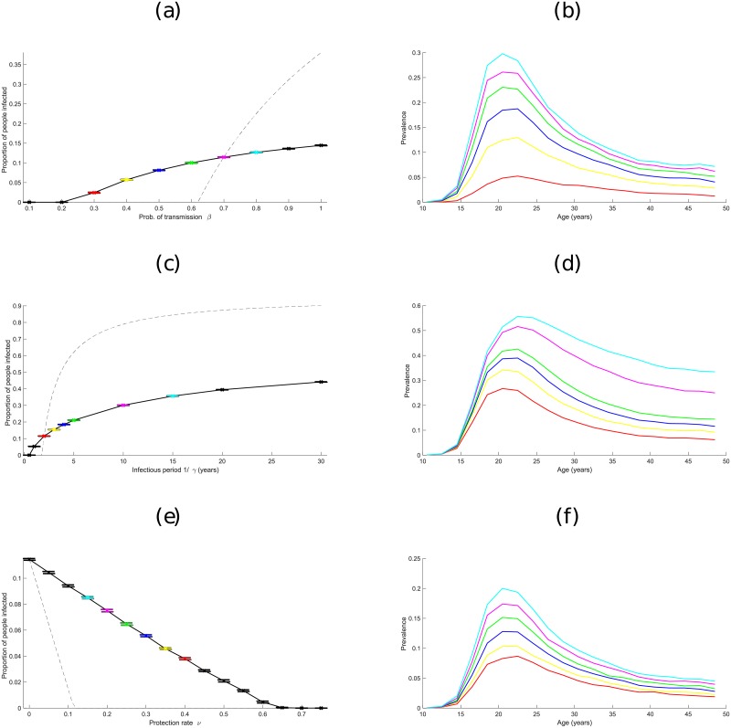
Fig 3. How prevalence of a generic STI varies, both at the population level and by age, at the end of simulations, when varying model parameters.
Plots (a), (c) and (e) show the effect of varying transmission probability β, recovery rate γ, and protection rate ν respectively. Dashed lines show the equivalent prevalences using the ODE model given by (3). Confidence intervals are shown by bars. Plots (b), (d) and (f) show prevalence broken down by age at different values of β, γ and ν, with the colour of lines corresponding to particular parameter values in plots (a), (c) and (e). For example, the red line in plot (b) shows prevalence by age when β = 0.3 in plot (a), the yellow line corresponds to β = 0.4, and so on. (Default values are β = 0.7, γ = 1 per year and ν = 0; these are linked to the deterministic model by assuming ).

