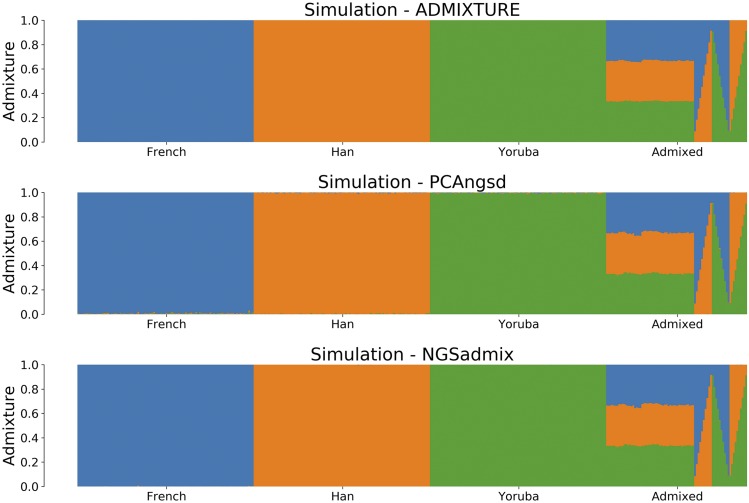
Figure 2.
Admixture plots for of the simulated dataset where each bar represents a single individual and the different colors reflect each of the K components. The first plot is the admixture proportions estimated in ADMIXTURE using the known genotypes, which we use as the ground-truth in our simulation studies. The second plot shows admixture proportions estimated using PCAngsd with parameter and the bottom plot using NGSadmix.

