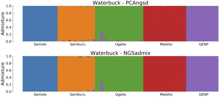
Figure 6.
Admixture plots for of the waterbuck dataset where each bar represents a single individual and the different colors reflect each of the K components. The first plot is the admixture proportions estimated in PCAngsd with parameter and the second plot shows the admixture proportions estimated in NGSadmix.

