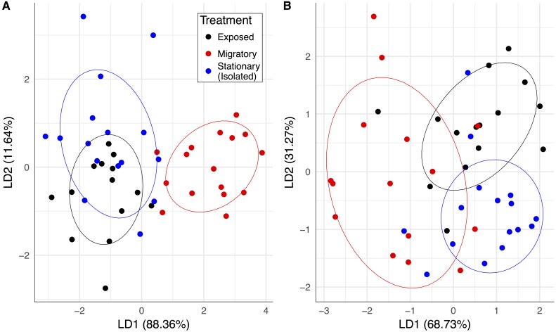
Figure 2. Pathogen community and colony health predicts treatment group membership.
Linear combinations from discriminant analyses created from all pathogen variables (except BQCV prevalence) and frames of bees for exposed (black), migratory (red) and stationary/isolated (blue) colonies. Axes represent the percentage of between group variance explained. (A) Experiment 1 at sampling event two, migratory and stationary colonies were separated by LD1 while stationary and exposed colonies are clustered. (B) Experiment 2 at sampling event three, after the exposed group had been allowed to forage alongside the migratory colonies, exposed and isolated were separated along LD2, while LD1 separated out migratory colonies.The significant PERMANOVA tests for both experiments corroborated the differences between group centroids. Circles represent 70% confidence intervals and are provided to visualize the centroids of each group.

