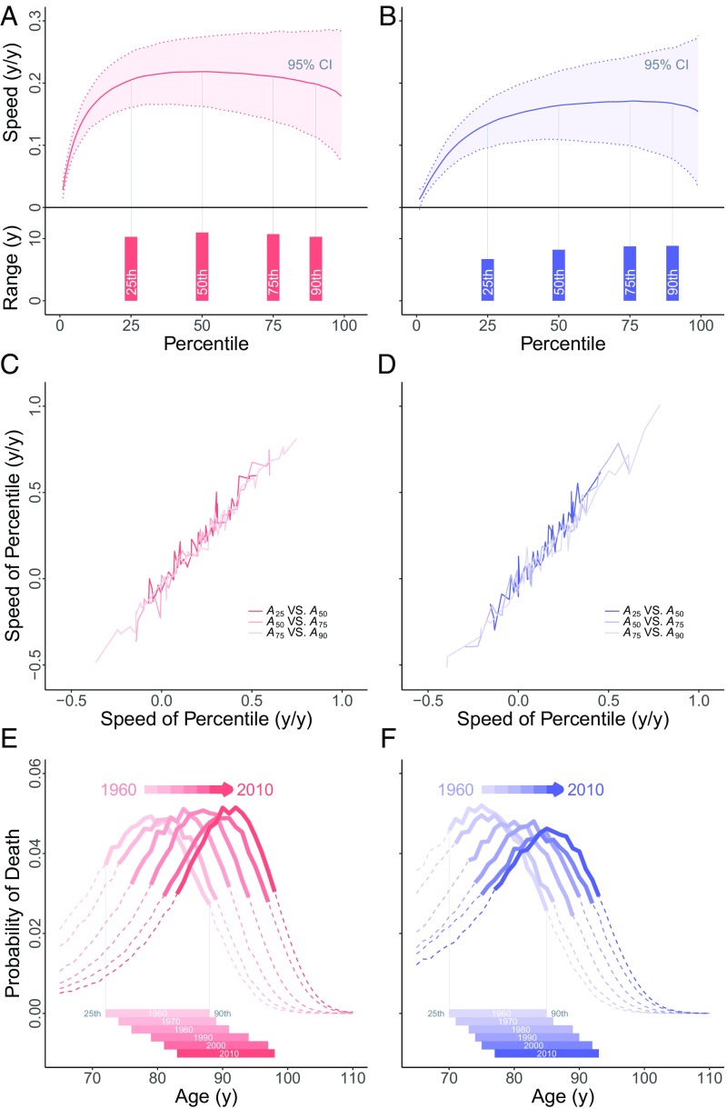
Fig. 2.
An example from Japan. (A and B) Speeds (rates of movement) for percentiles at every 1% (using raw data on death ages above ). (A and B, Top) Speeds for percentiles for females (A) and males (B). Solid line (red, respectively blue) indicates long-term speed. Percentiles from the 25th to the 90th show similar long-term speeds (note the vertical scale). Long-term speeds 0.2 y/y are shown for females. Also shown is the 95% confidence interval (1.96 × SD, distributions symmetric and approximately normal) for annual speeds: dotted lines and bands (pink, respectively blue). Annual variability is high (compare modest annual variability for intervals between percentiles, Fig. 1 C and D). (A and B, Bottom) Solid bars (red, females; blue, males) show ranges. (C and D) For each ending year, annual speeds of percentiles: (C) females in red and (D) males in blue. Shown is annual change in on the vertical vs. annual change in on the horizontal and correspondingly for the pairs and . (E and F) Probability distributions of deaths at 65+ y. Solid lines show advancing front of old-age survival (between and , dashes outside that range) for decades 1960–2010. (E) Females in red. (F) Males in blue. For each year, solid bars (E and F, Bottom) show distance between and .

