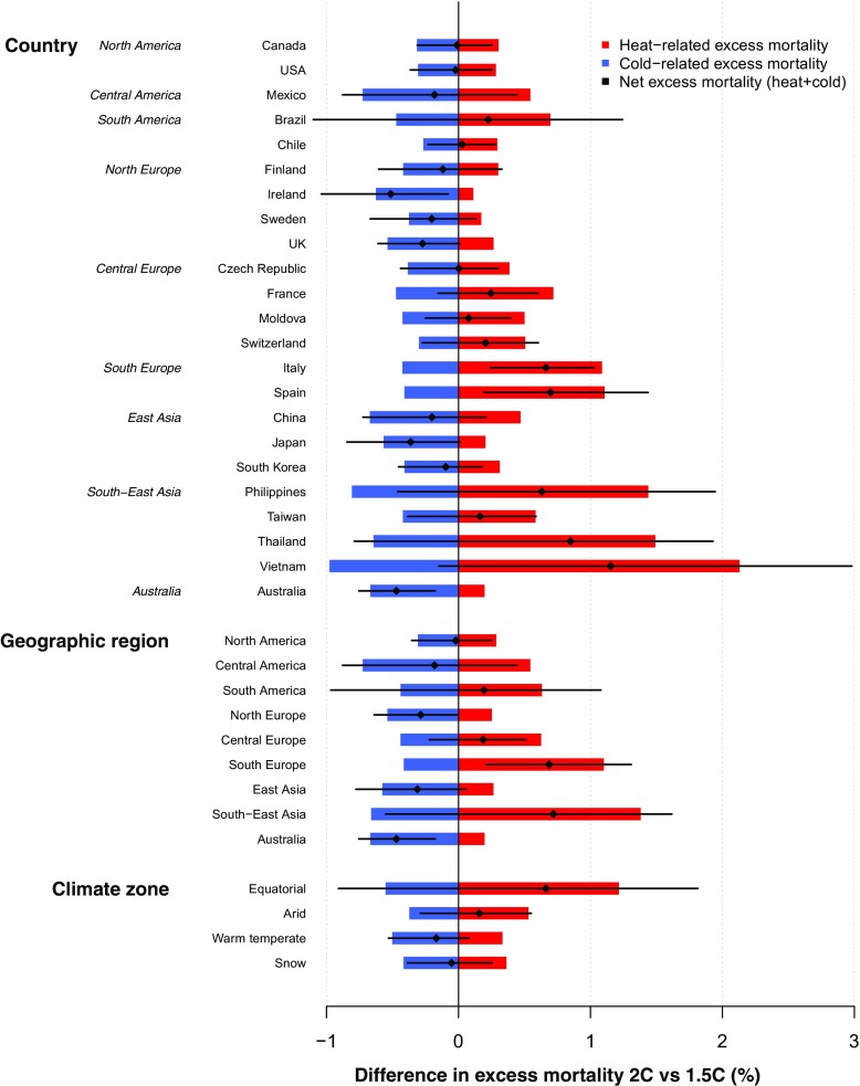
Fig. 1.
Change in excess mortality from 1.5- to 2-°C scenario by country, geographic region and climate zone. Red and blue bars represent changes in heat (above minimum mortality temperature) and cold (below minimum mortality temperature) excess mortality, respectively, and black diamond and bar correspond to net excess mortality (heat+cold) and 95% confidence interval.

