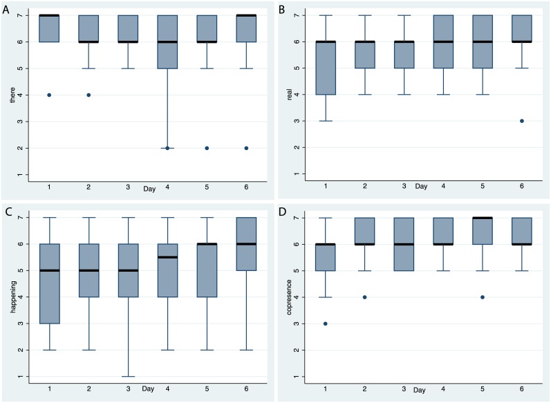
Fig 8. Box plots of the presence questionnaire scores over time.
(A) For there. (B) For real. (C) For happening. (D) For copresence. (see Table 1). The horizontal thick black lines are the medians, and the boxes the interquartile ranges (IQR). The whiskers extend from max(lowest value, 25th percentile—1.5*IQR) to min(greatest value, 75th percentile + 1.5*IQR). Values outside this range are shown individually.

