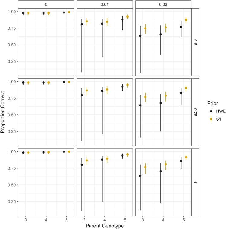
Figure 10.
The 0.05, 0.5, and 0.95 quantiles (across datasets) of the proportion of individuals genotyped correctly in an updog fit (y-axis) stratified by parent genotype (x-axis). Column facets distinguish different levels of overdispersion, while row facets distinguish different levels of bias (with 1 indicating no bias). Orange intervals correctly assume the individuals are from an S1 population while black intervals incorrectly assume the population is in HWE.

