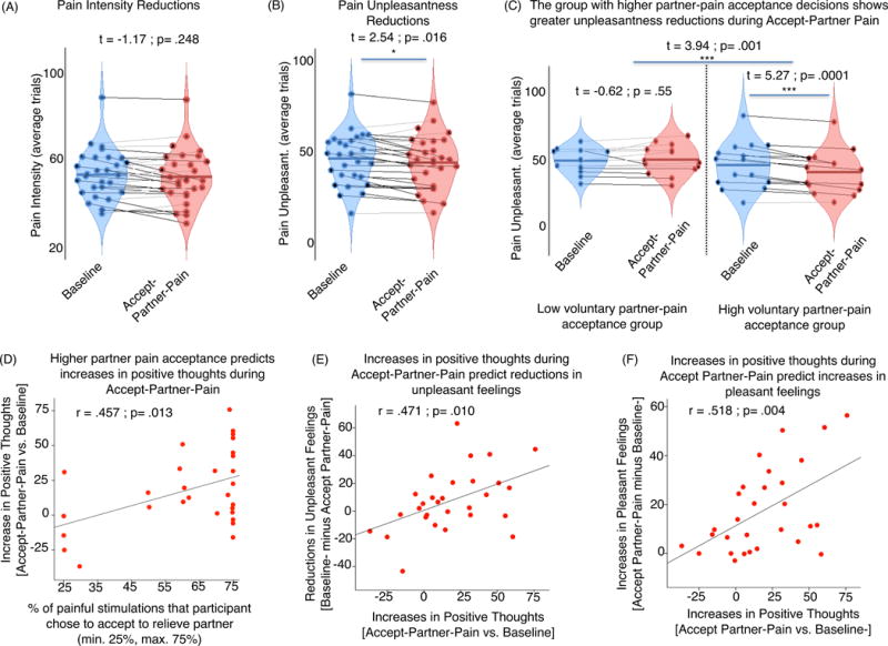
Figure 2. Behavioral pain-related effects of ”Accept-Partner-Pain” vs. “Baseline” conditions.

Red violin plots in panels (A), (B), and (C) indicate responses during ”Accept-Partner-Pain”, whereas blue violin plots correspond to “Baseline” control condition measures. Each dot in the violin plot figures represents one subject. Lines connect responses given by the same subjects. Black lines indicate subjects for whom responses go in the hypothesized direction. Gray lines indicate responses going in the opposite direction. For the analysis shown in panel (C), we also computed and report the correlation effect between partner-pain acceptance decisions and pain unpleasantness reductions during the Accept-Partner-Pain condition (r=.390, p=.036). Panels (D), (E), and (F) correspond to significant correlations.
