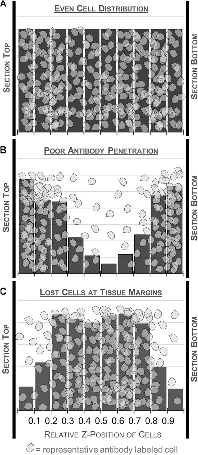
FIGURE 5.

Schematic illustrating different patterns of cell distribution through the tissue thickness as revealed by histograms charting the relative z-position of sampled cells across 10 bins. A relatively even distribution of cells throughout the thickness is ideal and suggests minimal impact of tissue processing (top, A). Fewer cells in the middle of the section could indicate poor antibody penetration (middle, B). This may warrant processing an additional series from the same case, changing variables that could affect antibody penetration. Histograms with fewer cells at the top and bottom of the tissue suggest cutting artifacts like plucked cells and lost caps may affect the distribution (bottom, C). Guard zones can be set to exclude these variable regions.
