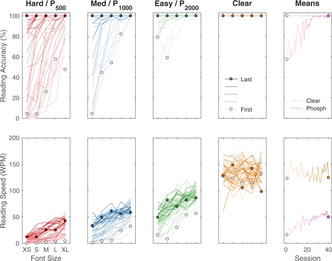
Figure 1.
Best Performing Subject. Complete data are shown from subject G, one of the best-performing in the study. Data have been plotted according to viewing condition (P500, P1000, P2000, PCLEAR, or Hard, Medium, Easy, and Clear) and across font sizes (FXS, FS, FM, FL, FXL or logMAR 1.0, 1.1, 1.2, 1.3, 1.4). The vertical axis of reading accuracy is the percent of words read correctly (upper row), and the vertical axis of reading speed is the number of words read correctly per minute (lower row). To highlight the progression of the learning process, early results are shown using traces with less saturated color, shifting to later results shown in more saturated color; data points from the first session are shown with open symbols, and data from the last session with filled. As time progresses through the 40 sessions (desaturated to colored), curves in the phosphene-view conditions move upward (or more accurately leftward as seen in Fig. 3) as the mean performance seen in the right hand column (magenta for mean over phosphene view) improves. Performance in the clear-view control condition (orange) does not show large-scale trends.

