
Figure 2.
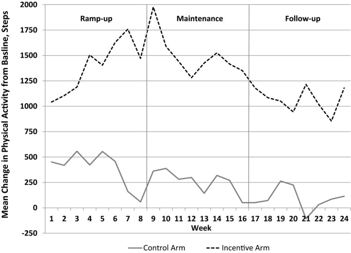
Central illustration, Unadjusted mean change in daily steps from baseline by study arm and week. Data presented are the difference between mean daily steps and mean baseline steps by week for each arm. Gray solid line represents patients in the control arm. Black dashed line represents patients in the financial incentive arm. Solid vertical gray lines represent the end of each study phase.