
Figure 3.
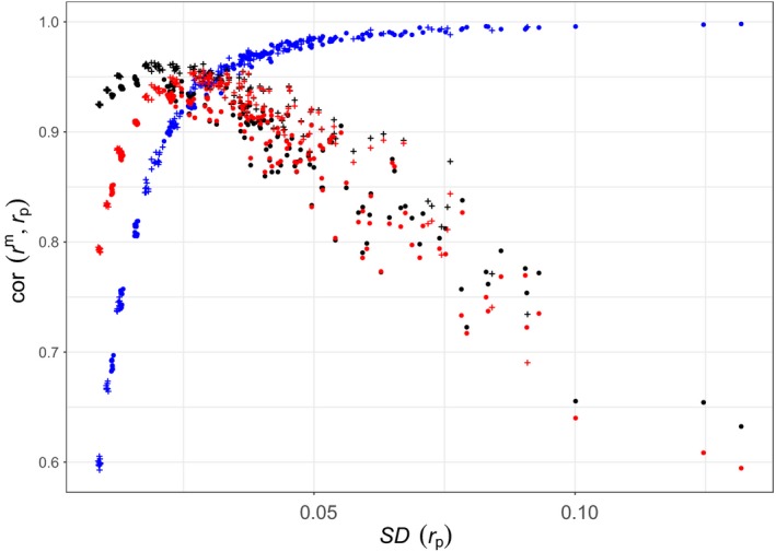
Correlation between marker‐based kinship with 42k SNPs and pedigree‐based prediction, against the standard deviation of pedigree‐based kinship. Each point corresponds to one of the 300 simulated pedigrees. Blue: r β; red: r w; and black: r u. Filled circles: monogamous pedigrees. +: random‐mating pedigrees [Colour figure can be viewed at http://wileyonlinelibrary.com]