Figure 3.

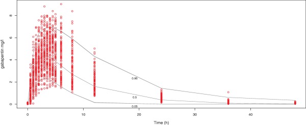
Scatterplot VPC, observed data from the study is represented in circles, prediction intervals (quantiles 0.05, 0.5, and 0.95) determined from 1,000 simulations as solid lines. [Color figure can be viewed at http://www.cpt-journal.com]

Scatterplot VPC, observed data from the study is represented in circles, prediction intervals (quantiles 0.05, 0.5, and 0.95) determined from 1,000 simulations as solid lines. [Color figure can be viewed at http://www.cpt-journal.com]