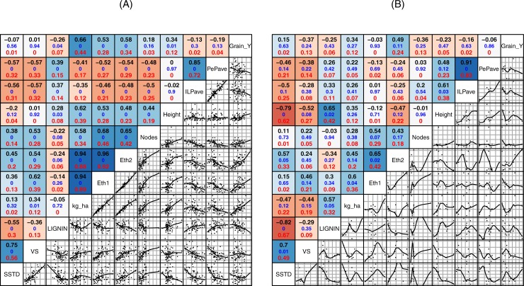
Fig 3. Scatter Plot and Pearson’s correlation coefficient matrix for comparison among phenotyping, saccharification and theoretical ethanol data.
Pairwise correlation analyses were performed for all assayed genotypes (a) and the 10 best genotypes for biomass yield (b). The upper panel above the diagonal shows Pearson’s correlation coefficients, p-value and regression coefficient. The lower panel below the diagonal gives their scatter plot. (SSTD = Saccharification standardized values under CNAP conditions, VS = Saccharification standardized values under IAS-CSIC conditions, Kg_ha = estimated weight of straw by hectare, Eth1 = Theoretical ethanol calculated with CNAP’s saccharification values and estimated biomass, Eth2 = Theoretical ethanol calculated with IAS-CSIC’s saccharification values and estimated biomass, ILPave = Average for straw wall thickness for largest internode, PePave = Average for straw wall thickness for peduncle, and Grain_Y = grain yield).

