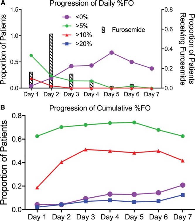
Fig. 3.

Line charts representing the progression of FO for the first 7 days of PICU admission. A, Progression of daily % FO, where the y axis is the proportion of patients with daily FO, and the x axis is the days of admission. “< 0%” is represented by open circles, “> 5%” is represented by gray circles, “> 10%” is represented by gray triangles, “> 20%” is represented by black squares; proportion of patients receiving furosemide each day is noted by bars. B, Progression of cumulative % FO, where the y axis represents the proportion of patients with cumulative FO, and the x axis represents the days since PICU admission.
