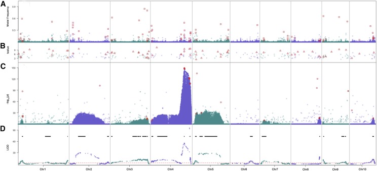
Figure 2.
Stacked plots of GWAS and QTL results. From upper to lower panels are results from the Bayesian-based multi-variant (A) stepwise regression (B) and single variant(C) models for GWAS and the joint QTL mapping result (D). The red dashed line in the QTL plot indicates the 1,000 permutation threshold and black lines show the QTL confidence intervals. Red squares in panel (A), triangles in panel (B) and circles in panel (C) indicate the kernel row number associated variants selected for further genetic validation.

