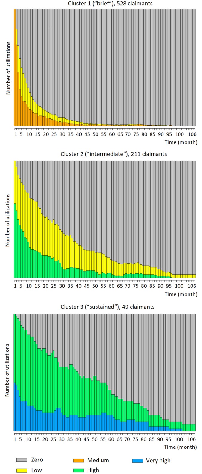
Fig 4. HMM state diagrams for the three clusters of the psychology service.

Each state of each HMM is represented by a pie chart. The number of utilizations associated with the state are displayed as slices of the pie, with the size of each slice proportional to how frequent each number appears. The pies are connected by edges which represent how long the state typically lasts, and how frequently it instead changes to another state (i.e., the transition probabilities).
