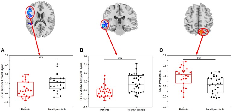
Figure 2.
Scatter plot of DC for the significantly decreased (increased) clusters between PI patients and healthy controls (r0 = 0.25). The difference between PI patients and healthy controls based on the DC in the left inferior frontal gyrus (A), left middle temporal gyrus (B), and right precuneus (C); Red dots: PI patients; black dots: healthy controls. Error bars represent standard deviation of the mean (**P < 0.001).

