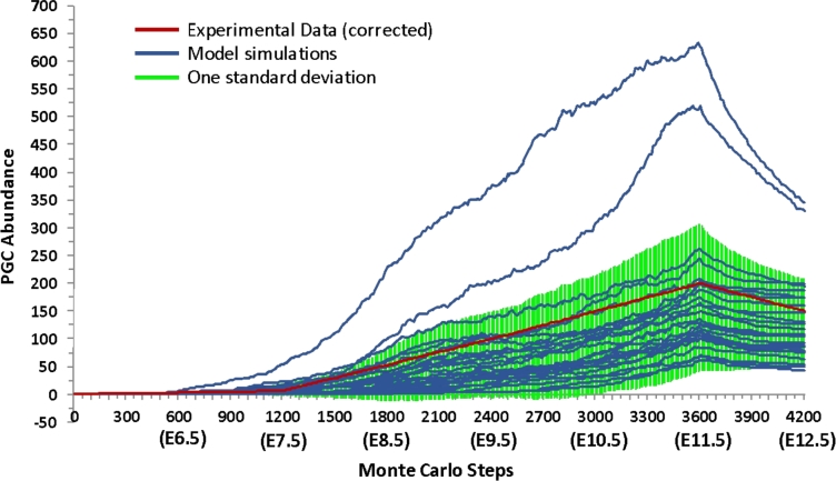
Figure 4.
The abundance of PGCs in Phase I of the simulation. Each blue line represents one of 25 simulation runs. The green area represents one standard deviation from the mean simulation run. Experimental data adjusted to represent one-sixth of the total abundance of PGCs are shown in red. [A colour version of this figure is available in the online version.]

