
Figure 5.
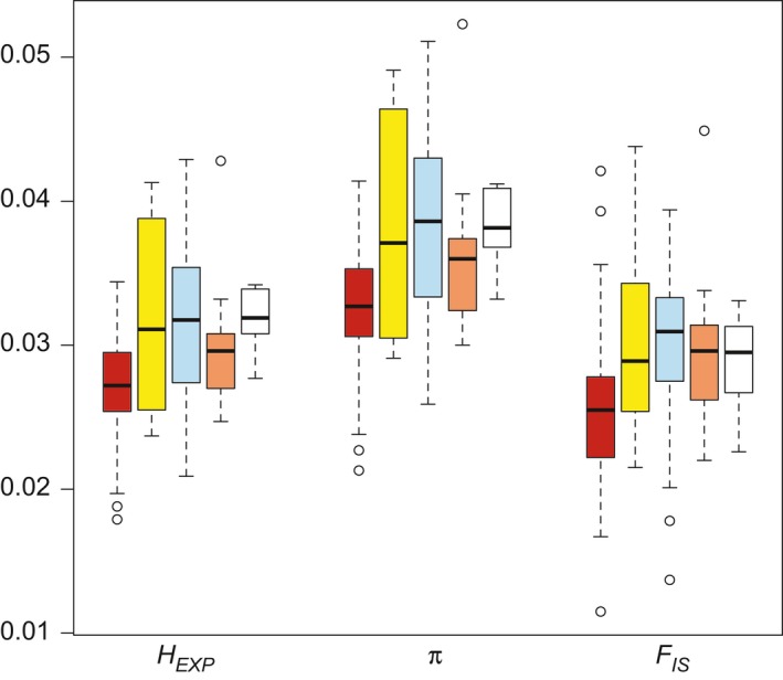
Comparison of genetic diversity statistics across populations identified in the K = 4 structure analysis (red—WAS, yellow—EGB, blue—WGB, and orange—P/W; see Figures 1 and 4 for population definitions). The white box‐and‐whisker plots represent the commercial germplasm sources. For each summary statistic (H EXP, expected heterozygosity; π, nucleotide diversity; F IS, inbreeding coefficient), the median, first and third quantiles, standard deviation, and range across populations are shown