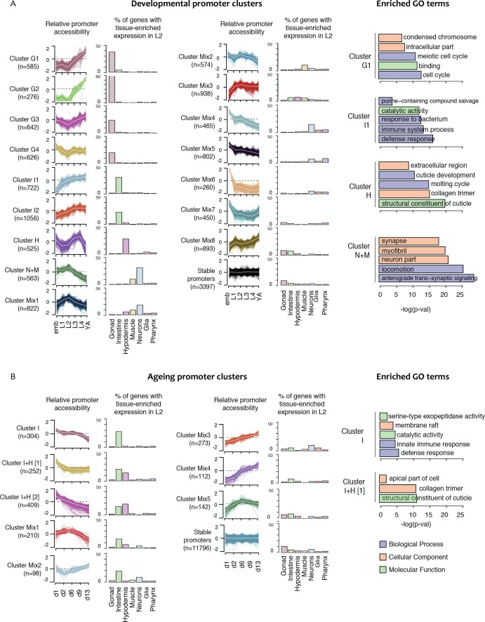
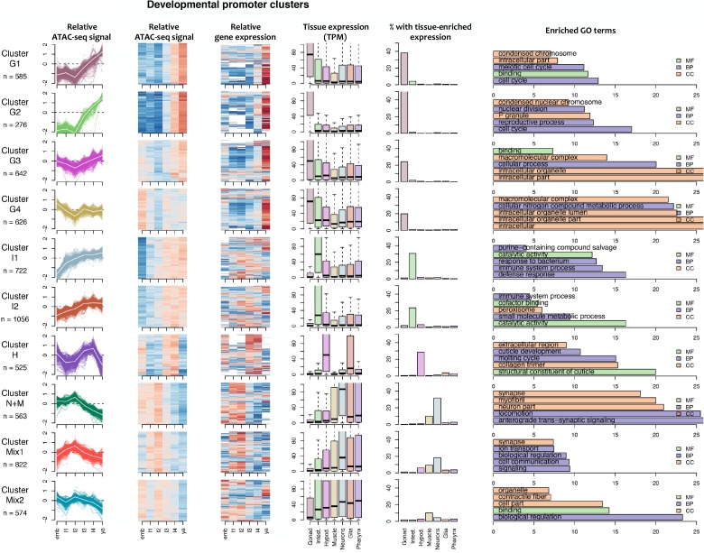
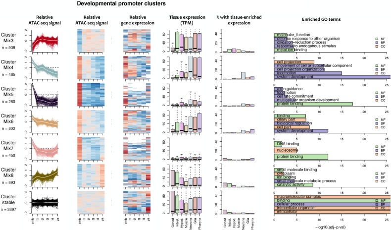
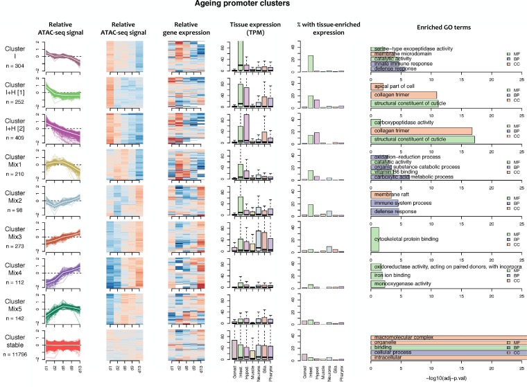
Figure 4. Shared dynamics of promoter accessibility in development and ageing.
Clusters of promoters with shared relative accessibility patterns across (A) development or (B) ageing. Relative promoter accessibility is log2 of the depth-normalized ATAC-seq coverage at a given time point divided by the mean ATAC-seq coverage across the time series (see Materials and methods). The percentage of associated genes that have enriched expression in the indicated tissues was determined from single-cell L2 larval RNA-seq data (Cao et al., 2017); see Materials and methods). Right hand panels show examples of GO terms enriched in genes associated with development or ageing clusters.


