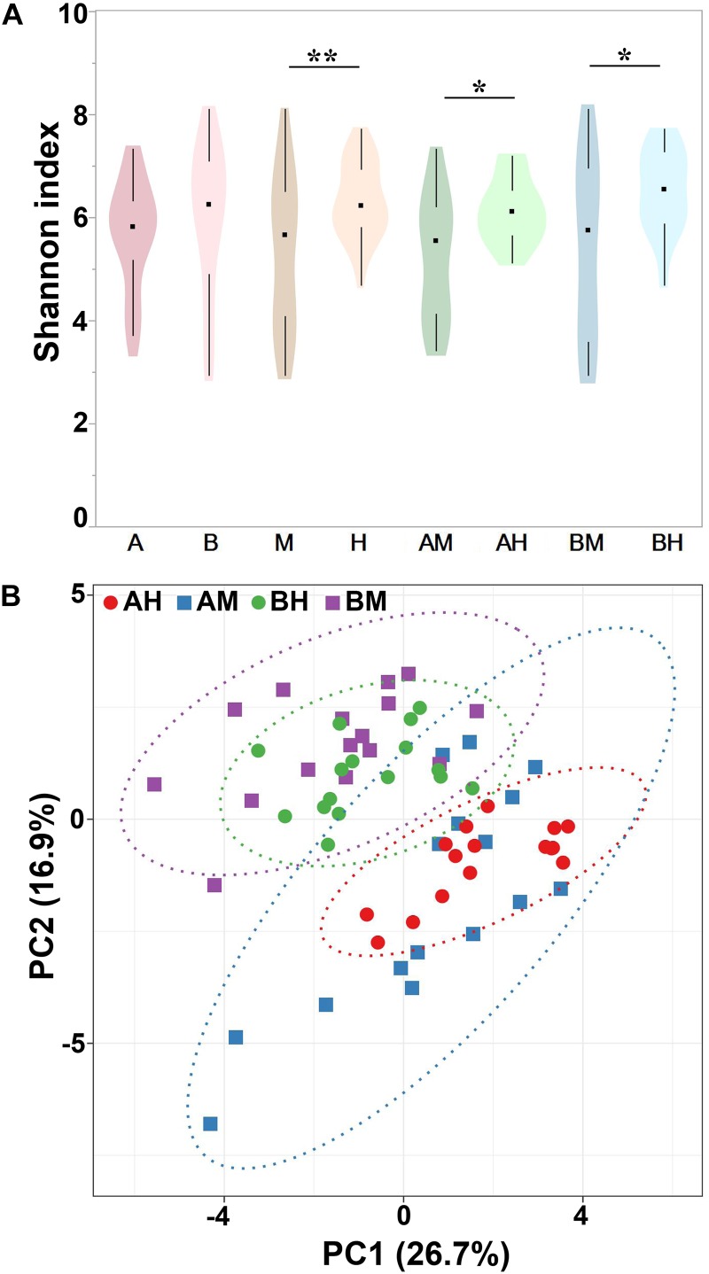
FIGURE 4.
Shannon index of different groups (A) and PCA analysis of each milk sample (B). Violin plots show the distribution of the Shannon indices of milk samples in each group, and the black points represent the medians of the Shannon indices of milk samples. ∗P < 0.05, ∗∗P < 0.01 indicates a significant difference compared between the Shannon indices of two groups.

