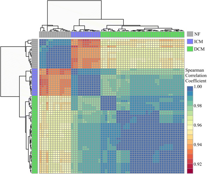
Fig. 2.
Correlation matrix between samples. The heatmap matrix shows the Spearman correlation coefficient between samples for all expressed genes following adjustment. Samples cluster by phenotype. Cooler colors (blues, greens) represent relationships between samples that are most similar; warmer colors (reds, oranges) represent samples that are more dissimilar with lower coefficients

