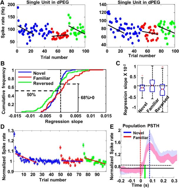
Figure 5.
A, Examples of spike counts by trials in two dPEG neurons in response to a stimulus when it was novel (blue), familiar (red), or reversed (green). Note that the first presentation of the familiar stimulus in Phase 2 occurred 20 min after the last trial of the same stimulus when it was novel in Phase 1. B, Cumulative frequency distribution of regression slopes for novel stimuli (blue), familiar stimuli (red) and reversed stimuli (green) in dPEG. Horizontal dashed line on the right indicated that 68% regression slopes obtained from novel stimuli were lower than zero. Horizontal dashed line on the left indicated that only 50% (chance level) of the regression slopes obtained from familiar stimuli were lower than zero. C, Box-and-whisker plot of regression slopes in dPEG for novel (left), familiar (middle), and reversed (right) stimuli. D, Population habituation curve in PEG. Each circle indicates responses averaged from all neurons (N = 83). Error bars on top of circles show SE. The first red line (across the blue circles) shows the linear regression fit for the first 25 trials of novel stimuli. The blue line shows the linear regression fit for familiar stimuli. The second red line (across the green circles) shows the linear regression fit for reversed stimuli. The two red lines were clearly tilted. The blue line was flat. Notice that the very first trials in all three conditions were excluded from this analysis. E, The temporal profiles of auditory responses to novel stimuli in dPEG (red) and to familiar stimuli (blue), calculated from averaged PSTHs across all neurons and all stimuli. Red dashed line shows stimulus onset time. The Black dashed line is the threshold calculated from the mean in the baseline plus SE (in 10 ms bins). The latency of the responses is marked by green vertical line. The peak of the PSTHs is indicated by the blue vertical line.

