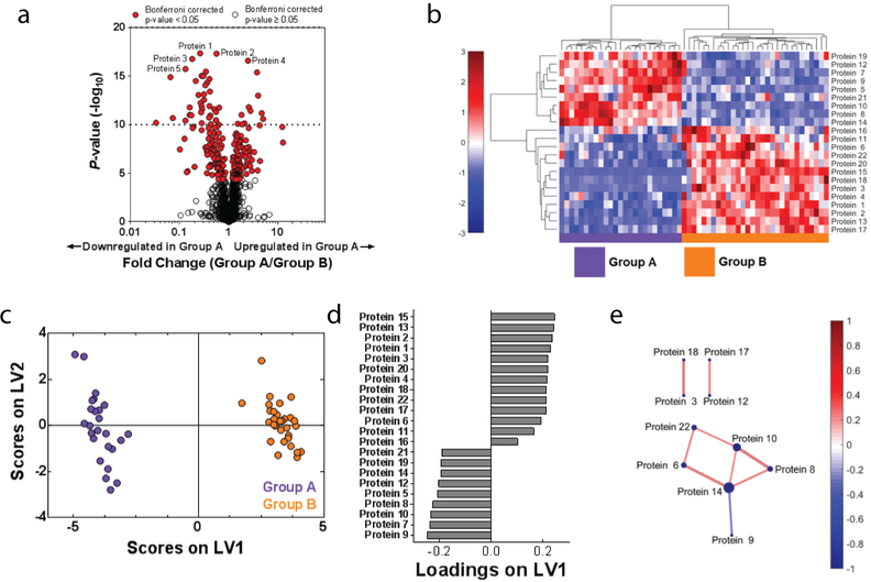
Figure 2. Data-driven analysis aids in proteome visualization.
(A) A volcano plot highlights significantly differences in expressed proteins between Groups A and B. Red indicates proteins that were significantly different (p < 0.05) between the two groups after correcting for multiple comparisons with the Bonferroni test. (B) Hierarchical clustering illustrates groupings of proteins that differ in expression between Group A and B. Color intensity indicates abundance, with increased expression in red, white unchanged, and decreased expression in blue compared to mean values (color bar to left of figure). Pearson’s correlation was used as the distance metric in this cluster. (C) A PLSDA scores plot illustrates distinct clustering between Groups A and B with loadings (D) indicating a distinct signature (determined using LASSO) of 22 proteins that best classified Groups A and B. (E) A protein correlation network based on protein expression in Group A. Each node is a protein, with lines indicating significant correlations (p < 0.05) to other proteins. Line thickness and color indicates Pearson’s correlation coefficient, with node size indicating the number of significant correlations. Significance was determined after correcting for the Type 1 error with the Bonferroni method.

