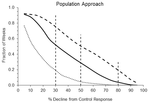
Figure 5.
Summary of the chance of a given % decline in mysid population size relative to the control response for each of the three exposures. The x-axis represents the estimated decline in the mysid population relative to the control. The y-axis is the fraction of weeks within the time series where a given decline (or greater) was present. The center solid line is for the “original” time series, the lower dotted line for the “x0.5” data, and the upper dashed line for “x1.5”. Vertical dashed lines represent % declines corresponding to IUCN categories of vulnerable (30%), endangered (50%) and critically endangered (80%).

