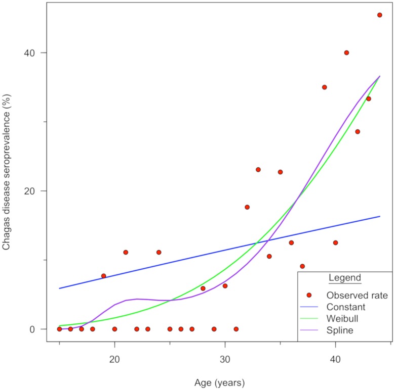
Fig 4. Risk of seroprevalence increases with age.

The Weibull catalytic model shows the best fit of estimated seroprevalence to calculate the force of infection. Observed seroprevalence and estimated seroprevalence of the three catalytic models. The red dots represent the observed rate: the blue, green and purple lines represent the Constant, Weibull and Spline catalytic models respectively.
