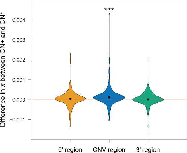
Fig. 3.

—Violin plots show the distribution of differences in average pairwise differences, π, between CNr and CN+ groups (CN+ minus CNr) for the CNV region (blue), and for the 5′ (yellow) and 3′ (green) regions flanking each CNV, pooling data from all CNVs and from the three populations analyzed. Black points indicate the median from each distribution. Mean increases are 15.5%, 4.7%, and 3.2%, with paired t-test P-values (represented by asterisks) of 0.181, 1.7e–04, and 0.326, for the 5′, CNV, and 3′ regions, respectively.
